BA3 - LEVEL DESIGN
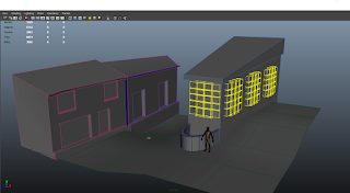
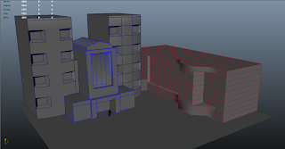
We started with directed study where we were given a scene to create in Maya. It was a relativity simple scene but had a lot of room for expansion once we have grasped the tools needed to create it.
After several mind breaking sessions in lesson and half a dozen YouTube tutorials later I came up with something that way mildly similar to the images.
At this point I was not aware on how to texture the buildings I had created so I left them at this stage, still quite unhappy with the outcome.
To improve the scene I think I would probably look at scale a bit closer along with more smaller objects to interact with rather then giant behemoth buildings.
Concept for my Level
At the time of creating my level I was heavily into my fourth play through of Fallout 3 so all I could think of is all things wasteland. So I took some time out from exterminating super mutants to do some sight seeing.
The art style is best described as Art-Deco, a popular decorative motif in architecture and design from mid 20's that went out of style around 1940. The form of the buildings mainly involve straight lines along with harsh angles to create exaggerated perspective along with warm colours and metallic textures on colossal scale. I've always had a soft spot for the art-deco style I especially like some of the British architecture from this period such as the victory coach station in London and paddington train station, you can clearly see the weight of the buildings in the materials used and really get a sense that they were built for a purpose and to last.
I did some very quick sketches to note down ideas that came to mind first then I could expand on these to bulk out a fully formed idea.
I looked into making a scene where the player would feel engulfed by the surrounding, this is an attribute I really enjoy when playing games. I find I personally get more involved in a game when the environment fully consumes me. So I decided to create an L-shaped layout to it would wrap around the player nicely and would also give the option to explore within tighter spaces.
I went through a couple of refinement processes to get to the style I had pictured in my mind along with looking at my reference photos. I found enjoyment and frustration trying to wrap my head around building a 2D image in a 3D space knowing things would not be as easy in Maya as they were on pen and paper.
Modeling
I first started off building the basic form of my building so I could later on build onto or chip away from the main structure.
Once I had created a shape and feel I liked the look of for my main building I decided to flesh it out a bit by adding small visual details.
Then I started construction to the outer sides to the building. I still wanted to keep the art-deco feel so I kept everything in straight edges and hard angles to make sure I would fit.
After this I went a head and built the second building which I originally want to connect to the main building via a bridge or tunnel.
As I slowly went through removing any excess edges and tidying up vertexes I didn't really like the look of the second building so much and thought it needed something else to make it stand out more from the other.
So I was playing around with the idea of adding a sign to the front of the building. Not knowing how to add text to Maya I head over to YouTube and found a video teaching me how to insert text and manipulate it into different forms.
But my version of Maya decided it wasn't having any of this lark and kept crashing so that idea came to an abrupt end.....for now.
Feeling disheartened and down in the dumps I went on a tidying spree removing all unnecessary faces and edges to save myself texturing parts that would not been seen by the player.
Once everything was sorted and nice and clean I started texturing the buildings, I wanted to do the back buildings first because they are a relatively simple shape and I wanted to get a feel for UV'ing before jumping in the deep end.
One problem I did encounter was that because I had made the building at the back one solid structure the textures were coming out blurry and unfocused so I decided to split them into two smaller easier to manage buildings.
After texturing my first building I decided that I want to interact with my world a little more then just a flat surface. Which led me to look at the stairways to the London underground stations. I really like the look of these iconic land marks across London they are very distinctive and outstanding in their environment.
I created a couple of sketches and built the one I favored the most.
This led me to adapt my second building to more of an office block adding variations in height rather then the one solid mass.
I also added little features like the air vents and the billboard to break up the surfaces.
More texturing occurred making sure that all UV's were in a TGA format so that I could bake the surfaces to add more depth to the sides creating the illusion of a 3D image.
The finished outcome


